One of the best examples of companies using infographics and perfecting data visualization is Whoop. Whoop is a wearable fitness tracker that describes itself as a minimalist, screen-free design that delivers lab like health and fitness results. Whoop does this by collecting biometric data and users input to give incredibly accurate data that can help users become healthier can change bad habits.

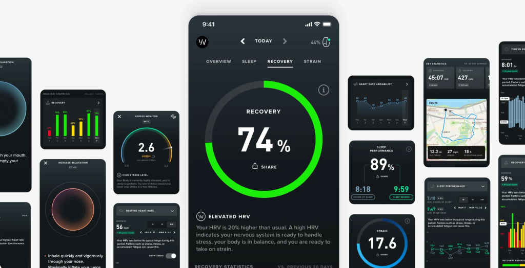
Whoop has perfected data visualization since there is no screen on their product. Instead, Whoop gives you results through an app on your phone. In the app there are charts and graphs displaying three main things. Strain (your exercise), recovery (how you recover from stress), and sleep (how well you are sleeping). Whoop then uses data from these three areas to give the user data and recommendations for how to be healthier.

Another feature of their data visualization is their weekly, monthly, semi-annually, and yearly reports. At each one of these points in time, for example every week and month, Whoop will collect your data into a printable report for you to see. It compiles everything and shows you whether you were around your average or if there were areas to improve in. For example, Whoop will tell you since you had a long stressful week, prioritizing sleep and recovery will help you get back to feeling one hundred percent next week. Whoop also relies on user journal inputs to help as well. One example could be taking magnesium. You journal you take a magnesium pill every day and Whoop will show you how it affected your overall health and make recommendations based on that.
Whoop’s website is full of infographics that show you how to use their product and the numerous benefits that it can have for you. These visualizations make it incredibly easy to see how Whoop is helping you and how to understand the data better.

Leave a comment